The History of the Apple Logo -
a series of articles at Macnyt
by Jens Hofman Hansen
When market analysts look at which brands are most valuable, Apple is often high on the list. Apple’s logo has helped build the brand they have today, and there is a long tale of genesis of the logo.
The full story on the genesis of the logo, it’s appearance, meaning and interpretations.
![]()
We all know apple’s characteristic apple logo, most of us remember the logo, as the joyous rainbow colored apple, sitting on every grey Macintosh. But when it comes to how Steve Jobs & Co. at the founding of Apple back in the seventies actually came up with the idea, that the company should be characterized by an apple, and why the apple logo looks like it does, most of us have to give up.
The primary source of information in investigating the history of the logo has of course been the sea of information on the Internet. There is, however no complete account on this particular bit of Apple history. Several hours of search for the history gives lots of fragments, but it‘s up to you to piece it together. A number of books on apple’s history adds even more to the full picture.
Macnyt has, once and for all, tried to put all the pieces together. For science, all sources of information is given. The following account is accompanied by pictures in a quality, giving justice to the history of the genesis of the logo.
Why “Apple” at all?
No one seems to know precisely why Apple came to be called Apple. No one would normally associate computers with an apple. We’ll later on see why it was a good idea to use an apple as company trade mark. Myth tells that there were several good reasons, that the choice fell on the apple. Steve Jobs is told to have been working on an apple farm in the summer of 1975 or 1976, and he admired The Beatles’ gramophone label “Apple Records”. As Steve Jobs and Steve Wozniak couldn't find a name for the company, they decided to call the company Apple. On April 1, 1976, Apple Computer, Inc. was founded. Macnyt may possibly follow up on the story on the choice of the name “Apple”, but we haven’t researched that fully as yet.
Following is documented how the company name had its logo, contributing in making Apple the strong brand it is today.
The Early Start and a missing Graphical Identity
Most may not realize that Apple in 1976 in fact did have a logo - and it was not an apple logo. The logo was far from stylish and wasn’t suited for reproduction in small sizes.
Steve Jobs quickly addressed the issue.
Looking at the instruction manual for Apple I, the very first computer made by Apple, the front page was embellished with this very complicated logo
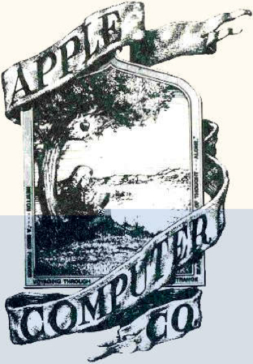
The logo requires some explanation. Apple was founded by three, Steve Jobs, Steve Wozniak and the less known Ron Wayne. It was Ron Wayne who, at the company start, made this ingenious Indian ink drawing, representing Isaac Newton sitting under an apple tree reading a book. The company name “Apple Computer Co.” on a fabric banner clings round the picture. Looking closely a text, running in the bottom part of the frame is seen, saying: “Newton... ‘A Mind Forever Voyaging Through Strange Seas of Thought... Alone.’ ” The quote is from the romantic English poet William Wordsworth (1770-1850), who in “The Prelude, Book Third: Residence of Cambridge” wrote:
And from my pillow, looking forth by light
Of moon or favouring stars, I could behold
The antechapel where the statue stood
Of Newton with his prism and silent face,
The marble index of a mind for ever
Voyaging through strange seas of Thought, alone.
The genesis of the world famous apple logo
The rainbow colored logo came about shortly before the launch of Apple’s second computer - the Apple II. The bite in the apple and the rainbow colors were added after some consideration. And the new logo was a rather costly matter, but Steve Jobs forced the multi-colored logo through.

It is said to be Steve Jobs who advocated that Apple should have a more stylish logo, according to several different sources, on the transition to the well known rainbow colored logo. According to the author of “The Little Kingdom: The Private Story of Apple Computer”, Michael Morritz, Steve Jobs actually believed, that the logo could be part of the reason for the slow sale of the Apple I.
According to Owen Linzmayer, author of “Apple Confidential”, Steve Jobs believed the logo was much too intellectual and wasn’t suited for reproduction in small sizes. It’s plausible that this is the reason, that Steve Jobs in April 1977 [4] asked Rob Janoff, art director of the advertising company Regis McKenna Advertising, to design a new logo. The advertising company Regis McKenna, wasn’t picked by coincidence to design the new logo. This company had helped for example Compaq, America Online, Intel and other computer companies through their early years [5]. Apple II was to be launched on April 17th 1977 at West Coast Computer Fair, so it was about time work on the new logo started.
The Bite of the Apple
According to Linzmayer, Rob Janoff started with a silhouette of a black apple on a white background, but felt that something was missing. A play on words that Apple previous had used in advertising for the Apple I, may have helped Janoff to the idea that a bite should be taken of the apple (playing on “taking a bite of the Apple”, where “bite”, is pronounced the same as the computer expression “byte” (as in Megabyte). The bite in the apple also meant the the logo no longer looked like or was confused with a tomato, Janoff has told.
Bill Kelley, also working for Regis McKenna Advertising, remember the history of the bite of the apple a bit different. He says that the bite was symbolic of acquire knowledge (as a biblical reference to eating of the apple of the tree of knowledge).
The apple logo appears in this manual for Apple I, without the characteristic bite:
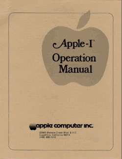
It should be noted that the manual dates from after the logo with the bite had been designed, but it is obvious that Apple’s design profile wasn’t quite in place in this early phase.
Colors and Stripes
According to Linzmayer’s book, Janoff added the colored stripes - green, yellow, orange, red, purple and blue - to the apple logo, because of the Apple II’s by then, impressive color possibilities. The logo was in fact used at the launch of the Apple II. Bill Kelley also remembers, that the colors in the logo were there because of the Apple II’s colorful possibilities - according to him though, it was Steve Jobs who came up with the idea with the colors and ended up specifying several of the hues.
The most expensive bloody logo ever designed
It appears that Steve Jobs was in charge of a large part of the work, designing the apple logo. It is difficult to print a logo in several colors, placed close to each other. The four color print technique, that is done in several steps, brings the risk that the different layers may be displaced and there by overlapping. Janoff suggested that the colored stripes should be separated by thin black lines, that would solve the problem and make the printing of the logo cheaper. Steve Jobs didn’t care and decided firmly that the logo should be without the marring lines. For the same reason Michael M. Scott of Apple has called the logo “the most expensive bloody logo ever designed”.
Jean Louis Gassée of Apple once said the following, which sums up the thoughts behind the legendary Apple logo: “One of the deep mysteries to me is our logo, the symbol of lust and knowledge, bitten into, all crossed with the colors of the rainbow in the wrong order. You couldn’t dream of a more appropriate logo: lust, knowledge, hope, and anarchy”.
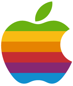
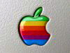
Here is the rainbow colored logo, as most of us have seen it, whether they’ve been near a Mac or not:
The Apple logo in the first printed matters
Apple’s new logo was used on computers, but also marked the company in printed matters, as in advertising and brochures. Even after the apple logo had been drawn, the logo actually changed over the first years. The accompanying font, stating the company name, is in itself worth a study.

In the beginning the Apple logo in printed matters were accompanied by the text “apple computer inc.” in the font face Motter Tektura. This fontface was designed by Otmer Motter of Vorarlberger Graphic in 1975 and was quite new, when Apple started using it. There was a single change to the original fontface: the dot over the i was removed. Below is an edition of the logo, where the colors of the logo isn’t included, because it is printed in negative and in one color.
The first brochure, published after the creation of the new logo, actually used the photo of a red apple. It was also the bureau of Regis McKenna, who created this brochure:

On opening the brochure, the real rainbow colored logo appeared at bottom right, as did the advertisements the Apple II was launched with.
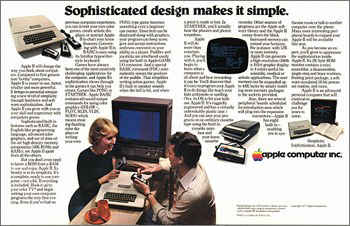
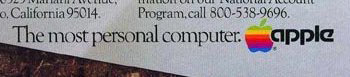
Apple over the years made the Apple logo and the accompanying text a little more stylish in advertising. In the early 80’ [12] the heavy “Apple Computer Inc.” was shortened to “Apple”, as seen in an advertisement for Lisa, June 1983 (from the magazine Personal Computing):
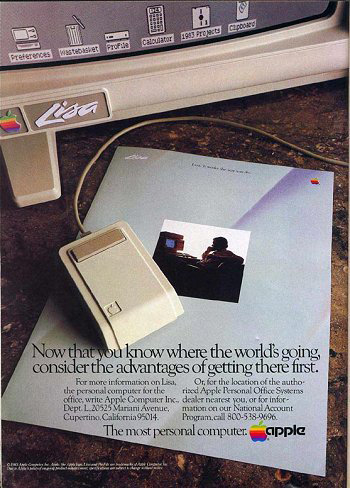
Zooming in on the logo at the bottom of the advertisement:
This section should in fact be on the Apple−logo in the early printed matters, but this early light sign with the rainbow colored logo and the Motter Tektura fontface had to be included:

The light sign can be purchased for an easy 2500 US$ at RedLightRunner.com (update: it seems that it has already been sold now).
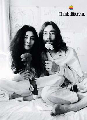
In 1984 Apple dropped the fontface Motter Tektura and replaced it by the more classical fontface Garamond, when the first Macintosh were introduced. Apple had a special edition of the fontface called Apple Garamond [13] draw, which is used for Apples printed matter until this day. The Apple logo has since then usually been used alone without any text, and if the company name was used with the logo, it was set at a distance and with the Garamond fontface. Frequently the logo was accompanied by a slogan set in the new Garamond fontface, for example “The power to be your best” or “Think different”:
The logo on the computers − a sign of quality
You have always been able to identify Apples computers by the small colorful logo. If there is an apple on that grey machine, you’ll know at once, you’re sitting at a Macintosh. The logos on the machines are exclusive small badges, here photographed once more with a special lens.
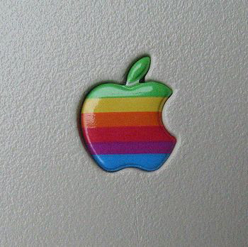
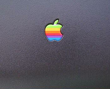
Apple’s rainbow colored logo has followed the computer since the Apple II and in marketing materiel, right up to 1998. On the computers, the logo was usually neatly put in relief on the housing on the front of the machine. Printers, most displays, scanners and other accessories from Apple has used this exclusive logo. Here are a couple of close−ups of the rainbow logo, as we all know it.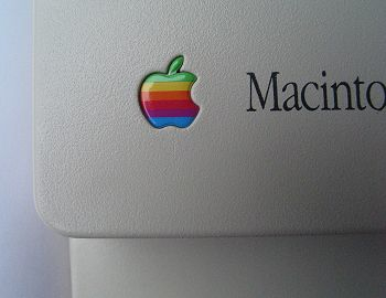
Front of a Macintosh Classic (1990)
Close−up of the logo on the Macintosh Classic.
The arched logo is a separate element, sunken in the grey plastic. The logo has it’s own part number with Apple and can actually be ordered as a spare part for old machines, if they fall out. If it gets scratched, it can be pinched out from the reverse side through a small hole in the grey plastic behind the apple.
The logos vary from product to product. On the PowerBook 5300 for example there is a somewhat smaller logo sunken into the lid:
All pictures are made with a Canon PowerShot G2 with Conversion Lens Adapter LA−DC58.
Copyright Jens Hofman Hansen and Macnyt.dk 2002.
The study of the different Apple logos on Mac’s are a story in itself. This documentation is limited to a few examples.
Further streamlining: The stripes disappear

To the dismay of many, the colors of the rainbow has disappeared from the Apple logo in recent years. In return, the apple has become more stylish and the “hippie” image has been dropped for a cool look. Who hasn’t looked with admiration at the shining white logo on a PowerBook?
After the introduction of Apple’s Garamond fontface one can hardly imagine a simpler and more clear image. The Apple logo was further cultivated from around March 1998, where the new Macintosh PowerBook G3 had an all white apple logo on the lid. If you opened the lid, you could still find the rainbow colored Apple logo, placed below the screen. According to Linzmaier, it was once again Steve Jobs, who decided what the logo should look like [14]. Here is the original packing from a PowerBook G3, which have both an all white and an all black Apple logo printed on it:
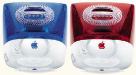
When the iMacs were introduced in August 1998 (were announced in May 1998) it was the first Macintosh ever, without the rainbow colored Apple logo at all. A slightly raised logo in the same color as the iMac was found on the back and on top of the machine. Here is an illustration of two iMac’s when they were introduced in new colors, seen from behind:
If you bought an iMac, the striped Apple logo hadn’t entirely disappeared − you could still find in the system software of Mac OS 8 and including version 9, for example in the “Apple menu” and in the “About this computer” window: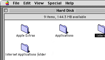
In the transition of 1999 and 2000 Apple made an other revision of the companies, the vendors and others use of the Apple logo. It was decided that the company name “Apple Computer” from now on should appear as “Apple”. The rainbow colored logo was officially declared deceased, and neither Apple nor the vendors were allowed to use the colorful logo anymore. For Apple’s use of the logo, a set of five logos in separate colors, were taken from the old rainbow logo. The new logos appeared slightly raised, to illustrate the apple logo in clear plastic on Apple’s new iMacs.
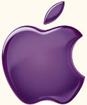
Here is a version in purple.
Apple’s vendors and other partners were only allowed to use the Apple logo in a “flat” version, either in black or red.
Apple wrote in a updated corporate identity guideline−document the following: “Like our products and our customers, the Apple brand continues to evolve. To reflect this, we’ve made some important changes to the Apple logo and how we use it, and how we expect our channel to use it, too. Don’t worry: We haven’t replaced the logo, just updated it. We’ll continue to reflect who we are and what we stand for as a company in the same timeless symbol: an apple with a bite taken out of it. We’ve reduced some of the clutter in the original design, however, and updated the way we use color and light. In other words, we’ve taken the same standards of style and innovation that make our products and our design unmistakable and applied them to the company logo. Instead of rainbow stripes, solid colors. Instead of just one solid color, a palette of logo colors to suit a variety of uses. Solid colors emphasize the timeless shape of the Apple logo”.
The replacement of the rainbow colored apple logo was a long process, starting prior to these expressions from Apple. On their web site, you could still find the rainbow colors in the navigation bar in April 1998, but the logo was probably replaces by the launching of the iMac.
Here is an example from www.apple.com, April 1998.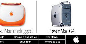
Here is an example from www.apple.com, November 1999.
In Mac OS X, the rainbow colors also disappeared from Apple’s system software: The Apple menu is still there, but the colors of the apple has all gone. In addition, the apple logo on the new iMac with flat−screen, introduced in 2002 and later on, the new 23” flat−screen, the eMac, and the Xserve, appeared in shining silver.
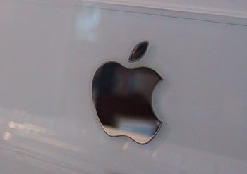
Here is the large silver logo on the front of the eMac.
Later interpretations of the logos meaning
One thing is, what a designer and others put into the making of the logo, as it is being made. Some else is, how the logo later on have been interpreted, and what the official explanation of the logo is.
![]()
Many feel to day that the rainbow colors creates psychedelic associations, that fits the alternative, a little flipped and creative image, that Apple acquired over the years, among others with their “Think different”−campaign.
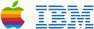
Others have suspected a quite clear comment to the IBM company that, at the creation of the Apple logo was archenemy an competitor to Apple. It is Per Mollerup, who in his thesis “Marks of Excellence” writes, that the stripes in the apple logo plays on the comparison with IBM, that also uses a striped logo. The polychrome Apple logo sets a creative and anarchistic distance to the monochrome and more boring IBM logo, representing a company that Apple regarded as stiff and conservative.
Which logo signals most creativity and user friendliness?
Per Mollerup has in fact had an official explanation from Apple (referenced in his book to Apple Law Department, 17th of August 1994) on the meaning of the trade mark, which reads as follows:
• The name starts with an A, and is therefore at the top of many catalogs.
• Normally you wouldn’t associate an apple with computers, and therefore the logo is easily remembered.
• The apple cause good feelings. It’s non−threatening and causes associations to health. “An Apple a day keeps the doctor away”, goes an old proverb.
The future Apple logo?
It will be exciting to follow the development of the Apple logo in the future. I have here tried to document the development from the complicated drawing of Newton with the apple to the rainbow colored logo, that went through several simplifications to end up as a polished silver apple on the front of the new Mac’s. The Apple logo doesn’t seem to be able to get more stylish than it is now. Who knows, maybe Apple will soon launch a retro product line with the old rainbow colored apple and the Motter Tektura fontface.
References:
The books
Linzmayer, Owen W: Apple Confidential: The Real Story of Apple Computer, Inc. Starch Press, 1999.
Mollerup, Per: Marks of Excellence. The history and taxonomy of trademarks. Phaidon, 1997.
Moritz, Michael: The Little Kingdom: The Private Story of Apple Computer. William Morrow, 1984. New York.